Browse By Unit
2.1 Introducing Statistics: Are Variables Related?
4 min read•june 18, 2024
Avanish Gupta
Jed Quiaoit
Avanish Gupta
Jed Quiaoit

image courtesy of: pixabay.com
Types of Data
We start off things with a review of categorical and quantitative data. Categorical data is data that is an attribute that is usually represented with a percentage or proportion, while quantitative data is data that can be represented by a number. If data can be averaged, it's quantitative. 🧍
Bivariate Categorical Data
When we collect data, we will record data from two different variables at the same time. Sometimes we have two categorical variables such as “class” and “does homework on time,” for example. We will want to know whether certain classes, such as juniors, finish their homework on time more than compared to other classes.
Bivariate categorical data refers to data that consists of two categorical variables. To analyze and understand the relationship between these two variables, we can use various graphical and statistical techniques.
One way to visualize bivariate categorical data is by using a histogram, which is a bar chart that shows the frequency or count of data points that fall into different categories. For example, if we have data on the class level (junior, senior, etc.) and whether or not students in each class finish their homework on time, we can create a histogram that shows the frequency of students in each class who do and do not finish their homework on time. 📚
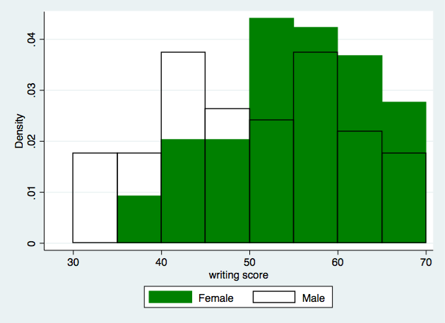
Source: UCLA Statistics
Another way to visualize bivariate categorical data is by using a frequency chart, which is similar to a histogram but shows the percentage of data points in each category instead of the count. This can be helpful if we want to compare the proportions of students in different classes who finish their homework on time. 🕝
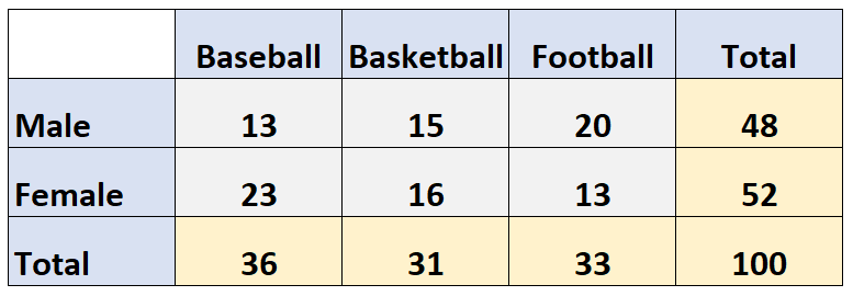
Source: Statology
A mosaic plot is another way to visualize bivariate categorical data. It shows the proportions of data points that fall into different categories by dividing the plot into rectangles that are proportional to the proportions of the data. Mosaic plots can be useful for showing the relationship between two categorical variables and for comparing the proportions of data points in different categories. 😀
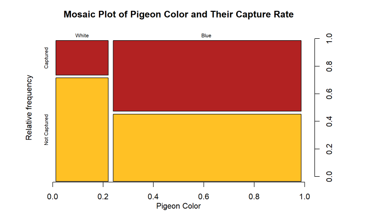
Source: Stack Overflow
Bivariate Quantitative Data
Other times, we’ll have two sets of qualitative data such as plant height and amount of fertilizer used and we’ll want to see whether more fertilizer is correlated with a taller plant. This type of data is usually represented using a scatterplot.
A scatterplot is a useful tool for visualizing the relationship between two quantitative variables. To create a scatterplot, we plot the values of one variable on the x-axis and the values of the other variable on the y-axis. This allows us to see if there is a pattern or trend in the data and to assess the strength and direction of the relationship between the two variables. ✊
In the plant example, we could create a scatterplot of plant height and amount of fertilizer used to see if there is a relationship between these two variables. If we observe a positive relationship, it would suggest that using more fertilizer is correlated with taller plants. On the other hand, if we observe a negative relationship, it would suggest that using more fertilizer is correlated with shorter plants. 🌱
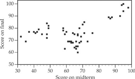
Source: Crack AP
In addition to visualizing the relationship between two variables, we can also use statistical techniques such as correlation analysis to quantify the strength and direction of the relationship. This can help us determine whether the relationship between the two variables is statistically significant and whether it is appropriate to use one variable to make predictions about the other.
How Can I Use This Data?
In both cases, we are trying to see whether both variables are related to each other. If we know that two variables are related to each other, then we may be able to predict the behavior of another variable if we know the value of one variable. Keep in mind that finding that two variables do not influence each other can also be just as strong of a analytical discovery than finding that they do influence each other. 🧲
Remember that the relationship between two variables can be positive, negative, or no relationship at all.
- A positive relationship means that as the value of one variable increases, the value of the other variable also tends to increase.
- A negative relationship means that as the value of one variable increases, the value of the other variable tends to decrease (and vice versa).
- No relationship means that there is no pattern or trend in the data and the two variables are not related to each other. Finding that two variables do not influence each other is also a useful and important analytical discovery. This can help us rule out certain variables as potential factors that may be affecting the outcome of a study or experiment, and can help us narrow down the factors that may be contributing to the observed relationship between the variables.
🎥 Watch: AP Stats - Scatterplots and Association
<< Hide Menu
2.1 Introducing Statistics: Are Variables Related?
4 min read•june 18, 2024
Avanish Gupta
Jed Quiaoit
Avanish Gupta
Jed Quiaoit

image courtesy of: pixabay.com
Types of Data
We start off things with a review of categorical and quantitative data. Categorical data is data that is an attribute that is usually represented with a percentage or proportion, while quantitative data is data that can be represented by a number. If data can be averaged, it's quantitative. 🧍
Bivariate Categorical Data
When we collect data, we will record data from two different variables at the same time. Sometimes we have two categorical variables such as “class” and “does homework on time,” for example. We will want to know whether certain classes, such as juniors, finish their homework on time more than compared to other classes.
Bivariate categorical data refers to data that consists of two categorical variables. To analyze and understand the relationship between these two variables, we can use various graphical and statistical techniques.
One way to visualize bivariate categorical data is by using a histogram, which is a bar chart that shows the frequency or count of data points that fall into different categories. For example, if we have data on the class level (junior, senior, etc.) and whether or not students in each class finish their homework on time, we can create a histogram that shows the frequency of students in each class who do and do not finish their homework on time. 📚

Source: UCLA Statistics
Another way to visualize bivariate categorical data is by using a frequency chart, which is similar to a histogram but shows the percentage of data points in each category instead of the count. This can be helpful if we want to compare the proportions of students in different classes who finish their homework on time. 🕝

Source: Statology
A mosaic plot is another way to visualize bivariate categorical data. It shows the proportions of data points that fall into different categories by dividing the plot into rectangles that are proportional to the proportions of the data. Mosaic plots can be useful for showing the relationship between two categorical variables and for comparing the proportions of data points in different categories. 😀

Source: Stack Overflow
Bivariate Quantitative Data
Other times, we’ll have two sets of qualitative data such as plant height and amount of fertilizer used and we’ll want to see whether more fertilizer is correlated with a taller plant. This type of data is usually represented using a scatterplot.
A scatterplot is a useful tool for visualizing the relationship between two quantitative variables. To create a scatterplot, we plot the values of one variable on the x-axis and the values of the other variable on the y-axis. This allows us to see if there is a pattern or trend in the data and to assess the strength and direction of the relationship between the two variables. ✊
In the plant example, we could create a scatterplot of plant height and amount of fertilizer used to see if there is a relationship between these two variables. If we observe a positive relationship, it would suggest that using more fertilizer is correlated with taller plants. On the other hand, if we observe a negative relationship, it would suggest that using more fertilizer is correlated with shorter plants. 🌱

Source: Crack AP
In addition to visualizing the relationship between two variables, we can also use statistical techniques such as correlation analysis to quantify the strength and direction of the relationship. This can help us determine whether the relationship between the two variables is statistically significant and whether it is appropriate to use one variable to make predictions about the other.
How Can I Use This Data?
In both cases, we are trying to see whether both variables are related to each other. If we know that two variables are related to each other, then we may be able to predict the behavior of another variable if we know the value of one variable. Keep in mind that finding that two variables do not influence each other can also be just as strong of a analytical discovery than finding that they do influence each other. 🧲
Remember that the relationship between two variables can be positive, negative, or no relationship at all.
- A positive relationship means that as the value of one variable increases, the value of the other variable also tends to increase.
- A negative relationship means that as the value of one variable increases, the value of the other variable tends to decrease (and vice versa).
- No relationship means that there is no pattern or trend in the data and the two variables are not related to each other. Finding that two variables do not influence each other is also a useful and important analytical discovery. This can help us rule out certain variables as potential factors that may be affecting the outcome of a study or experiment, and can help us narrow down the factors that may be contributing to the observed relationship between the variables.
🎥 Watch: AP Stats - Scatterplots and Association

© 2024 Fiveable Inc. All rights reserved.