Browse By Unit
1.5 Representing a Quantitative Variable with Graphs
5 min read•june 18, 2024
Jed Quiaoit
Lusine Ghazaryan
Jed Quiaoit
Lusine Ghazaryan
Remember from a previous section that quantitative variables refer to variables that can be measured or counted and have a numerical value. Under quantitative variables are two mini-types:
- A discrete variable can take on a countable number of values. The number of values may be finite or countably infinite, as with the counting numbers. Examples of discrete variables include the number of children in a family or in a class, the number of cars in a parking lot, and the number of votes received by a political candidate in a mayoral election. 🚗
- A continuous variable can take on infinitely many values, but those values cannot be counted. No matter how small the interval between two values of a continuous variable, it is always possible to determine another value between them. For example, it is not possible to count the number of possible values for height, because there are an infinite number of possible values between any two given values. ♾️Other examples of continuous variables include the length of a piece of wood, the time it takes to run a marathon, and the temperature of a room.
This time, we'll describe how we organize and display quantitative data. The frequency table is a bit complicated for quantitative data, especially if we deal with vast amounts of data. The good news is that AP doesn’t require you to make one from scratch, so we will skip this one. Just know that many computer programs, including our mighty Microsoft Excel, and your TI series calculator can make it in seconds. The main displays we will discuss are histograms, polygons, ogive, stem-and-leaf plots, and dot-plot.
Histograms
A histogram is a graphical representation of a distribution of data, where the data is divided into piles called bins. The bins are created by dividing the range of the data into equal-width intervals, and the height of each bar in the histogram corresponds to the number or proportion of observations that fall within the interval represented by that bar. The width of the bars represents the interval width, and the x-axis represents the values of the data. 😍
Source: W3Schools
Unlike the bar graphs, there is no space between histogram bins. If there is a space, then that indicates an actual gap in data with no values. The height of bins represents the frequencies of the classes. Remember, always check the quantitative data assumption to verify the right graph or display.
Frequency Polygons
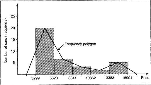
Frequency polygons display the distribution of quantitative data by using lines and connecting points at the midpoints of the classes for each bin. It is similar to a histogram, but instead of using bars to represent the frequencies, it uses lines that connect the points at the top of the bars. 🔸
To create a frequency polygon, you need to first create a frequency table that shows the number of observations (frequencies) for each value or interval of values in the data. The x-axis of the frequency polygon represents the values or intervals of the data, and the y-axis represents the frequencies. Then, you can plot the points at the top of each bar and connect them with lines to create the polygon. ✏️

Source: ScienceDirect
Cumulative graphs (Ogives)
A cumulative graph, also known as a cumulative frequency plot or an ogive, is a graphical representation of a cumulative distribution. It is used to show the number or proportion of a data set that is less than or equal to a given value. The cumulative frequency adds the frequencies by each class. Ogives help us determine the position of data to see how many values are below or above a certain value. ➡️
To create a cumulative graph, you need to first create a cumulative frequency table that shows the number or proportion of observations that are less than or equal to each value or interval of values in the data. The x-axis of the cumulative graph represents the values or intervals of the data, and the y-axis represents the cumulative frequencies. Then, you can plot the points and connect them with a line to create the cumulative graph.
Source: Allan G. Bluman. Elementary Statistics. A Step By Step Approach. McGraw Hill. Eighth Edition. 2009
These three graphs are very common in academic research and in the corporate world with additional levels of complexity every now and then!
Stem-and-Leaf Plots (Stemplots)
Stem-and-leaf plots are a simple graphical representation of a distribution of a quantitative variable. They are similar to histograms, in that they show the distribution of the data, but they differ in that they preserve the individual values of the data (histogram relies on grouped data, thus missing the individuals in the bins). 🗑️
To create a stem-and-leaf plot, you need to first split each data value into a "stem" (the first digit or digits) and a "leaf" (usually the last digit). The stems represent the tens digit of each value, and the leaves represent the units digit. Then, you can arrange the stems and leaves in a table, with the stems on the left and the leaves on the right. Whenever you make a stemplot, don’t forget to provide the key to help the reader how to read it with the appropriate context in mind! 🍃
Here is an example of how to create a stem-and-leaf plot for the data values 23, 28, 35, 40, 45, 65, 68, 69, and 84:
2 | 3 8
3 | 5
4 | 0 5
6 | 5 8 9
8 | 4
In this example, the stem "2" represents the values 20-29, and the leaf "3" represents the value 23. Similarly, the stem "4" represents the values 40-49, and the leaf "5" represents the value 45.
💡 TIP: Turn the stem-and-leaf plot on its side to see any unusual things that data will have for you to be aware of it.
Dotplots
Dotplots are more similar to stemplots, but this time each observation is represented by a dot. The position of each dot on the horizontal axis corresponds to the data value of that observation, and the dots are stacked on top of each other when the values are nearly identical. Moreover, if you forget how to write the numbers, then this is the best display for you! 🔴
It is simple and less time-consuming as it use dots instead of digits to construct it. Dot-plots are the first choice when we deal with a small set of data.
To create a dotplot, you need to plot a dot for each data value on the horizontal axis, with the position of the dot corresponding to the value of the data. You can also use different symbols or colors to distinguish between different categories or groups of data.
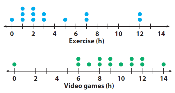
For example, a pediatrician might be interested in seeing how a sample of 14 children spend their time in the day with regards to exercise and recreational activities like video games. Dot plots for both activities might appear similar to those shown by the diagrams below: 🎮

Source: Onlinemath4all
🎥 Watch: AP Stats - Displaying Quantitative Data with Graphs
Key Vocabulary
- Histogram
- Relative Frequency Polygon
- Ogive
- Stemplot
- Dotplot
<< Hide Menu
1.5 Representing a Quantitative Variable with Graphs
5 min read•june 18, 2024
Jed Quiaoit
Lusine Ghazaryan
Jed Quiaoit
Lusine Ghazaryan
Remember from a previous section that quantitative variables refer to variables that can be measured or counted and have a numerical value. Under quantitative variables are two mini-types:
- A discrete variable can take on a countable number of values. The number of values may be finite or countably infinite, as with the counting numbers. Examples of discrete variables include the number of children in a family or in a class, the number of cars in a parking lot, and the number of votes received by a political candidate in a mayoral election. 🚗
- A continuous variable can take on infinitely many values, but those values cannot be counted. No matter how small the interval between two values of a continuous variable, it is always possible to determine another value between them. For example, it is not possible to count the number of possible values for height, because there are an infinite number of possible values between any two given values. ♾️Other examples of continuous variables include the length of a piece of wood, the time it takes to run a marathon, and the temperature of a room.
This time, we'll describe how we organize and display quantitative data. The frequency table is a bit complicated for quantitative data, especially if we deal with vast amounts of data. The good news is that AP doesn’t require you to make one from scratch, so we will skip this one. Just know that many computer programs, including our mighty Microsoft Excel, and your TI series calculator can make it in seconds. The main displays we will discuss are histograms, polygons, ogive, stem-and-leaf plots, and dot-plot.
Histograms
A histogram is a graphical representation of a distribution of data, where the data is divided into piles called bins. The bins are created by dividing the range of the data into equal-width intervals, and the height of each bar in the histogram corresponds to the number or proportion of observations that fall within the interval represented by that bar. The width of the bars represents the interval width, and the x-axis represents the values of the data. 😍
Source: W3Schools
Unlike the bar graphs, there is no space between histogram bins. If there is a space, then that indicates an actual gap in data with no values. The height of bins represents the frequencies of the classes. Remember, always check the quantitative data assumption to verify the right graph or display.
Frequency Polygons
Frequency polygons display the distribution of quantitative data by using lines and connecting points at the midpoints of the classes for each bin. It is similar to a histogram, but instead of using bars to represent the frequencies, it uses lines that connect the points at the top of the bars. 🔸
To create a frequency polygon, you need to first create a frequency table that shows the number of observations (frequencies) for each value or interval of values in the data. The x-axis of the frequency polygon represents the values or intervals of the data, and the y-axis represents the frequencies. Then, you can plot the points at the top of each bar and connect them with lines to create the polygon. ✏️

Source: ScienceDirect
Cumulative graphs (Ogives)
A cumulative graph, also known as a cumulative frequency plot or an ogive, is a graphical representation of a cumulative distribution. It is used to show the number or proportion of a data set that is less than or equal to a given value. The cumulative frequency adds the frequencies by each class. Ogives help us determine the position of data to see how many values are below or above a certain value. ➡️
To create a cumulative graph, you need to first create a cumulative frequency table that shows the number or proportion of observations that are less than or equal to each value or interval of values in the data. The x-axis of the cumulative graph represents the values or intervals of the data, and the y-axis represents the cumulative frequencies. Then, you can plot the points and connect them with a line to create the cumulative graph.
Source: Allan G. Bluman. Elementary Statistics. A Step By Step Approach. McGraw Hill. Eighth Edition. 2009
These three graphs are very common in academic research and in the corporate world with additional levels of complexity every now and then!
Stem-and-Leaf Plots (Stemplots)
Stem-and-leaf plots are a simple graphical representation of a distribution of a quantitative variable. They are similar to histograms, in that they show the distribution of the data, but they differ in that they preserve the individual values of the data (histogram relies on grouped data, thus missing the individuals in the bins). 🗑️
To create a stem-and-leaf plot, you need to first split each data value into a "stem" (the first digit or digits) and a "leaf" (usually the last digit). The stems represent the tens digit of each value, and the leaves represent the units digit. Then, you can arrange the stems and leaves in a table, with the stems on the left and the leaves on the right. Whenever you make a stemplot, don’t forget to provide the key to help the reader how to read it with the appropriate context in mind! 🍃
Here is an example of how to create a stem-and-leaf plot for the data values 23, 28, 35, 40, 45, 65, 68, 69, and 84:
2 | 3 8
3 | 5
4 | 0 5
6 | 5 8 9
8 | 4
In this example, the stem "2" represents the values 20-29, and the leaf "3" represents the value 23. Similarly, the stem "4" represents the values 40-49, and the leaf "5" represents the value 45.
💡 TIP: Turn the stem-and-leaf plot on its side to see any unusual things that data will have for you to be aware of it.
Dotplots
Dotplots are more similar to stemplots, but this time each observation is represented by a dot. The position of each dot on the horizontal axis corresponds to the data value of that observation, and the dots are stacked on top of each other when the values are nearly identical. Moreover, if you forget how to write the numbers, then this is the best display for you! 🔴
It is simple and less time-consuming as it use dots instead of digits to construct it. Dot-plots are the first choice when we deal with a small set of data.
To create a dotplot, you need to plot a dot for each data value on the horizontal axis, with the position of the dot corresponding to the value of the data. You can also use different symbols or colors to distinguish between different categories or groups of data.
For example, a pediatrician might be interested in seeing how a sample of 14 children spend their time in the day with regards to exercise and recreational activities like video games. Dot plots for both activities might appear similar to those shown by the diagrams below: 🎮

Source: Onlinemath4all
🎥 Watch: AP Stats - Displaying Quantitative Data with Graphs
Key Vocabulary
- Histogram
- Relative Frequency Polygon
- Ogive
- Stemplot
- Dotplot

© 2024 Fiveable Inc. All rights reserved.